Project 203-1
Color
By Judy Hendrix
There is a power in color—we see the world in color, even dream
in color. It can create happiness, sadness, be calm and cool or bright
and bold. We are influenced in color choices by the clothes we wear and
by decorating our homes. We tend to be conservative and match things,
go neutral or buy in “sets” so our choices are good ones.
Step out of the box with your jewelry, with just a few basic color theories.
Remember: your jewelry can be your personal statement.
The color wheel makes it easier to see the “relationships”
in color. Here are 3 ways to describe color on the wheel:
- HUE—single color with all of it’s hues (Kelly green, forest green, mint green etc)
- VALUE—has nothing to do with COLOR itself—it is a comparison of the color in a scale of grays that range from black to white. It is the first aspect of a piece the viewer will perceive—the range of values will evoke an emotional response.
- SATURATION– it is the relative brightness or dullness of a color. At the most saturated, nothing has been added. This gets into tints, tones & shading.
Here is an easy way to choose a color scheme: take a piece of fabric you like & match the colors, tones & intensity of the colors.
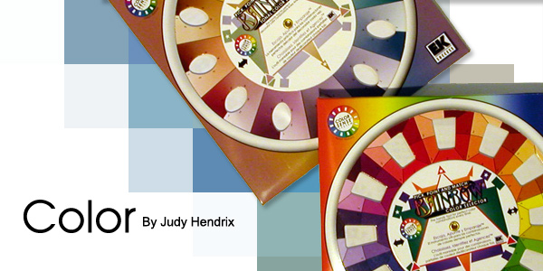
THE WHEELS (2073TL)
Take them with you when choosing to identify cool & warm, related
vs. complimentary & opposites – it will help make predictable
choices.
Traditional color wheel
1. black arrow – directly across (opposites)
2. red arrow – equal distance.
3. orange arrow –
4. beads strung with colors next to each other – warm hues, 5 side by side in warm colors
5. show split down the middle for warm & cool – every warm has a cool color contrast.
The Tonal Wheel (3127TL)
This is the same as the traditional wheel but with muted tones. Some people
are more comfortable working here, especially in pastels.
We have talked mainly about color in a very simplistic manner. You literally
could spend a lifetime studying color & all it’s possibilities.
Here are a few other observations:
- Understand the properties of the medium you are using. In beads,
there is a shine or glossy look (opalescent) that you can’t get
in any other medium AND it will affect your piece.
- Silver, gold, copper, brass etc. can completely change the look of
your piece.
- When making a commercial design – match color for color, shine,
shades, texture etc. to get the look that appealed to you. Put them
in the same spot – don’t just pick a new color and hope
it will work. You don’t need the same bead, just the same properties.
When working with color follow your own instincts.Take the time to play
and experiment, that’s how we learn.